The Behemoths: stage by stage
One of my major projects is a graphic novel, The Boy with Nails for Eyes. I began the book back in 2004, and this here is one of the first images I completed when I began working on it in earnest around 2007 or 2008: the Behemoths. This is how that image came together.
Stage 1: rough sketch
This rough sketch was done in Photoshop. I worked quickly, keeping it loose, concentrating on layout rather than detail.
This stage enables me to get a feel for the problems that will come up ahead of time. The Behemoths are the main element. The secondary elements are the town in the foreground and the crows overhead.
As it turned out, things got a lot more complicated, since the composition changed to give more prominence to the secondary stuff.
Stage 2: first Behemoth
First thing to do was build the Behemoths. This was the most intimidating part of the image, and hence the most interesting – both good reasons to tackle this first.
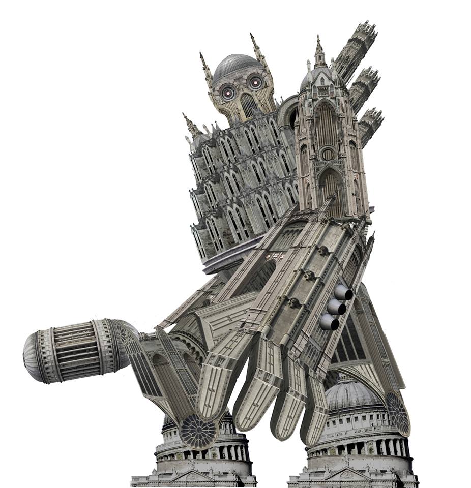
This Behemoth was, like all of them, composed of photos – Bristol Cathedral, Wills Memorial Building, Yorkminster and St Paul’s Cathedral, which were cut up and rearranged in Photoshop.
If printed full-scale, the Behemoth would stand around three metres high, maybe more.
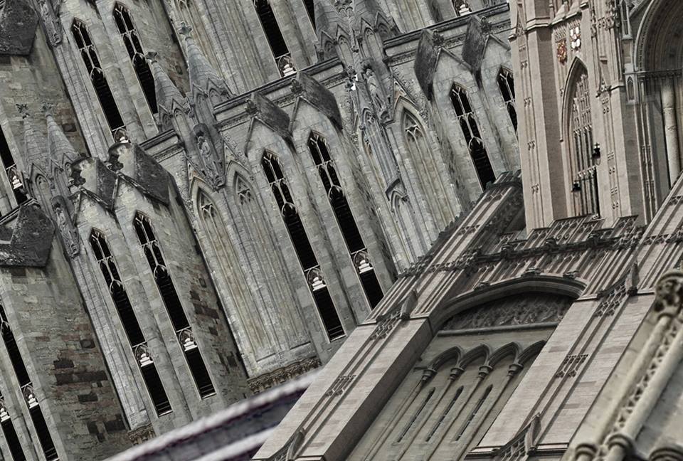
Close-up – the elements in the background are buttresses from Bristol Cathedral (with windows added). The foreground elements (the crook of the elbow) are combinations of Bristol Cathedral and Will’s Memorial Building. 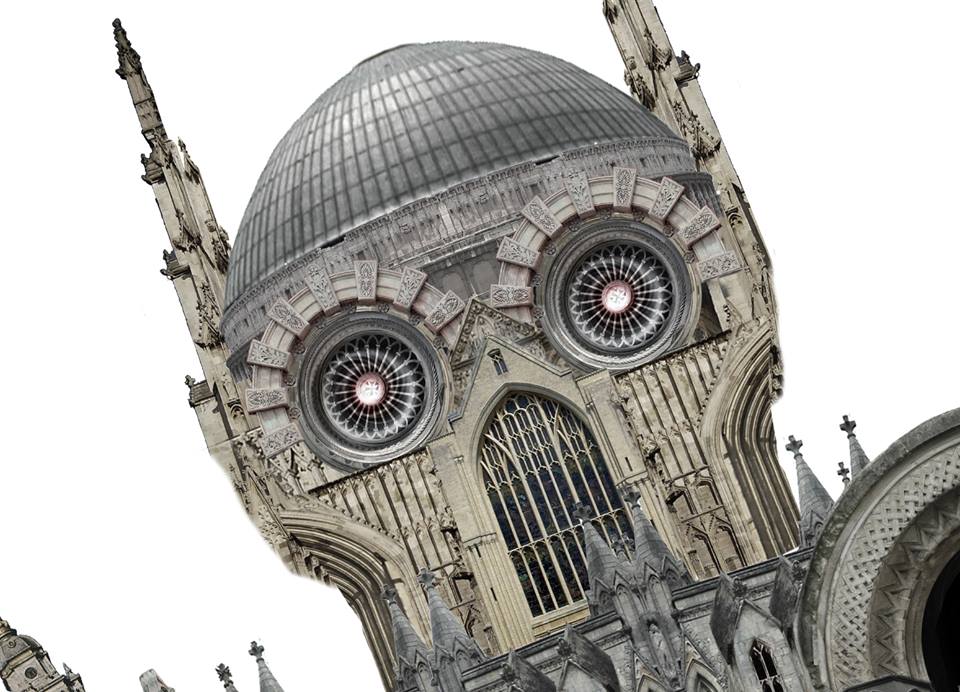
The face. The dome is from the Blue Mosque in Istanbul, the rest is a combination of Yorkminster and random churches and buildings around Bristol.
Stage 3: the Town
Next was the town. I soon realised that the way I’d planned the image initially wouldn’t work.
As this image was part of the story’s prologue, setting needed to be firmly established. The view I’d first chosen avoided showing too much of the town, losing a chance to embed the reader further into the story-world. I decided to compose the shot from a more distant perspective, showing more of the town where the story would, after all, take place
Using a Victorian map, I put a basic layout of the town together, again in Photoshop (the image, an unused page from the comic, above shows the result in the first panel).
This was a very useful exercise; realising the town’s layout was a foundation for planning views depicting it. Later on, the drawings of the town I needed to do became so complicated that I built a 3D version of the town using Sketchup. This enabled me to place a camera anywhere I wanted in the environment, and make decisions on composition before I touched pencil to paper.
Stage 4: drawing
The drawing. This was done at A2 on Bristol board, which is beautifully smooth stuff.
The original sketch was a simple outline in ‘F’ pencil (my favourite, as it erases cleanly without smuding).
The final render was done using inkwash (i.e. diluted water-fast Indian ink), graphite, chalk, charcoal, & acrylic, then scanned into Photoshop.
Stage 5: Photoshop
Colour and clouds
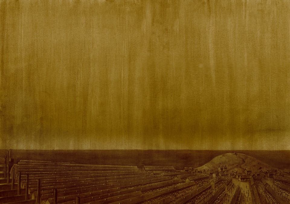
Colours added in Photoshop.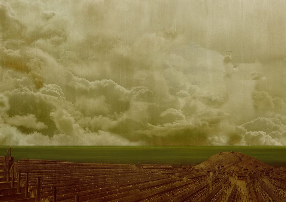
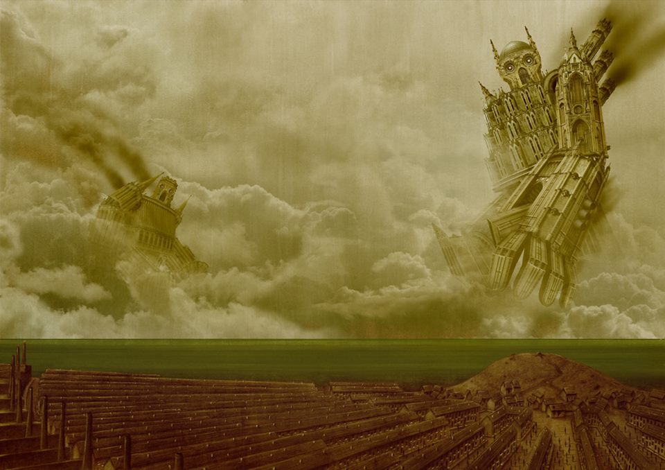
Clouds and sea added.
In Photoshop, the first thing to do was add colour. The basic tone was a yellow ocre, which formed the ‘base’ colour for the book as a whole. plus once that was in place, the levels were tweaked to bring out the details in the image.
Photographs were brought in for the clouds. These were taken by me over several years. The tricksiest bit of this stage was trying to get the clouds to blend together. I didn’t bother carrying this out where the main Behemoth would go – to leave this ‘unfinished’ irked me, but why waste the effort on what wouldn’t be visible?
Finally people in the streets were added digitally.
Blending in the Behemoths
Next, bringing in the Behemoths. The first Behemoth has been covered – the more distant one is mainly made from photos of a single building, in this case Bristol Cathedral.
I made this approach a key facet of future Behemoths, drawing upon a single building for the bulk of their ‘character’. This made them both simpler to put together, and more readily distinguishable as characters.
Digital masks were used to blend the Behemoths into the clouds. Exhaust smoke was painted in digitally.
Painting in the fog
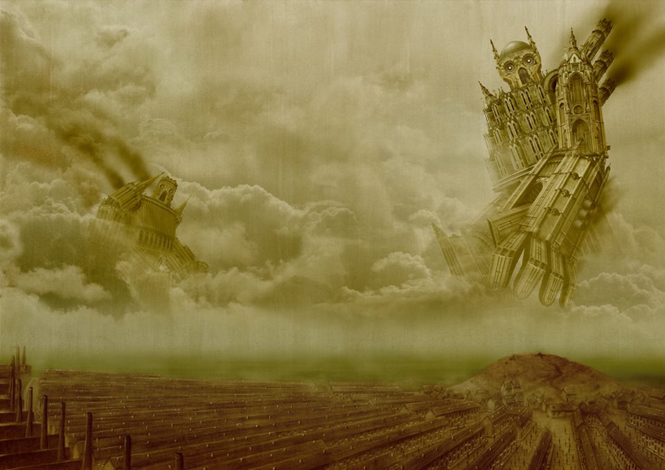
Fog added. 
Fog – close-up.
Fog. Again, this is a key story element.
Rather than just go with digital painting, which can look flat, I used masks over a scan of textured paper, to add visual interest to what could otherwise knock the image down a little.
The most difficult aspect here was painting the fog through the network of streets in the town, without the clear outlines of the buildings being lost.
Drawing in the crows
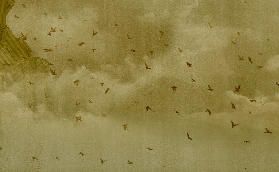
Next, the crows. These were drawn in pencil and then scanned before being scattered through the image.Some layers were given transparency to fake an effect of distance.
I’m still not totally satisfied with the crows (there’s some visible repetition) – but nothing’s ever finished, you just walk away.
Painting in the smoke
Smoke from the chimneys is added. Again, this was using digital painting.
I cheated this bit, rendering the nearer smoke more transparent to enable the Behemoths to be seen. Later depictions of the smoke were more dense, so this is a trick I’ll have to think hard about using again.
The final tweaks: levelling and blending
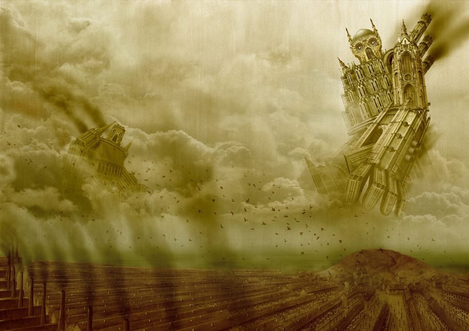
The final image. At this stage, it was just a case of tweaking the light levels to draw attention to the right elements, and to add drama and to draw the eye in a careful way around the image.
From start to finish, this took about two months, working every spare hour I could scrape.

